OMEN Command Center
Challenge
OMEN Command Center is a software utility for gamers to maximize their hardware capabilities on their gaming PC and also improve gameplay. On HP's gaming keyboards, there are macro keys, an additional set of 6 programmable keys, for gamers to record keystrokes or sequences. Our users could not easily record sequences in the current experience and our team was tasked to redesign the holistic experience.
My Role
Lead UX/UI Designer
Understand, Unpack, Uncover
Firstly, we started with understanding why users even need this feature and going through a teardown of the existing Macro Key experience. Macro Keys was a way users could record a long spell or action move into one single key, so that in gameplay they would just have to click one key. We also discovered that this value proposition was not just restricted to gaming but also for email salutations/signatures, or even for those who worked in excel. Early user feedback has highlighted that our value proposition resonated more with gamers but not limited to that persona.
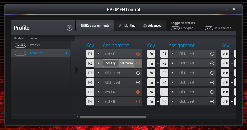
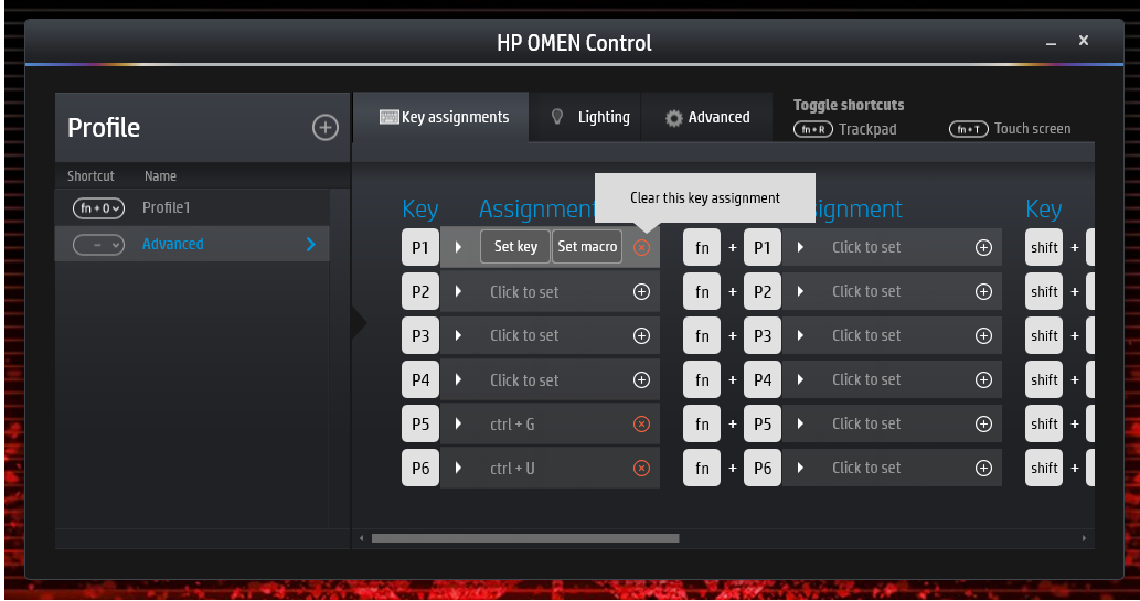
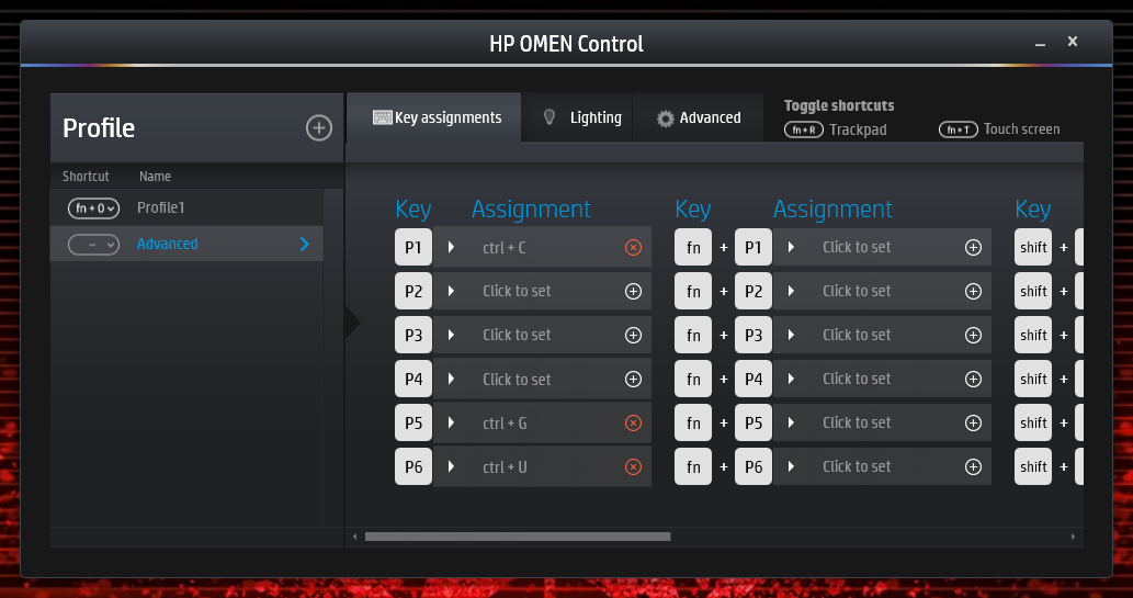
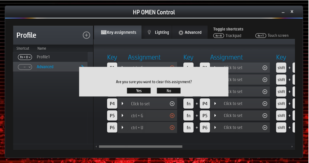
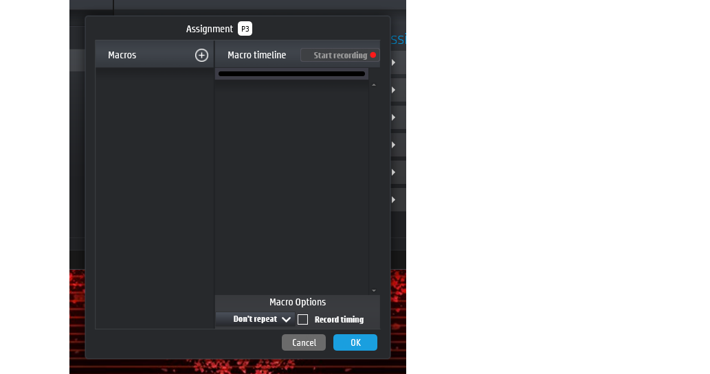
"Macro Keys helps save a lot of time and clicks when I'm gaming" is a statement we heard in early testing.
As a team, we believe that brainstorming and writing out the key user scenarios is always helpful to understanding out customer journey. This also helps verbalize the flows so that when presenting to stakeholders we're able to not let our WIP designs takeaway from the main focus and experience we're targeting.
Sketching and wireframing is the most accurate way to validate our assumptions and understand how real users interact with Macro Key creation. Over a couple weeks, we came out with an initial user flow and tested it with gamers. With a visual of the keyboard and which programmable 'p' key you recorded your sequence in, users could visually see which 'p' key there were recording. This also combined the need to assign and record on separate screens, which we later decided to put into one screen.
Feedback suggested that more people create a recording after having selected which 'p' key, so based on this learning, we made sure to design for this need.
We did quick clickable prototypes to test the flow and we found many people wanted two things
to edit a Macro recording after the fact
to see all the Macro recordings they've created


